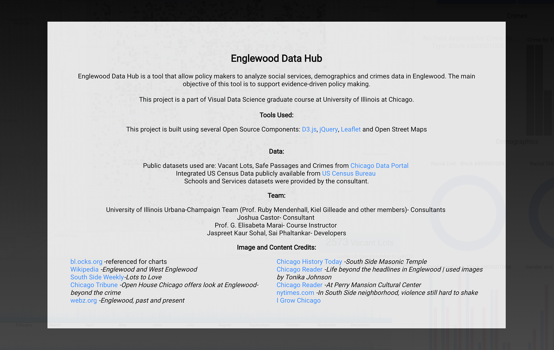
Englewood Data Hub is a tool that allow policy makers to analyze social services, demographics and crimes data in Englewood. The main objective of this tool is to support evidence-driven policy making, that is to assist policy makers in gaining insights from data to form better informed decisions to ensure safety and development in Englewood. Further this tool raises awareness among general public about the efforts being taken by the community to improve the conditions prevailing in Englewood.
Skills Learned
Technologies - D3, JavaScript
Data Abstraction, Data Modeling, Visualization Design, Storytelling
Client Interviewing, Requirement Analysis, Testing, Evaluation, Documentation, Presentation and Teamwork
Data
Various datasets used for the project include:
Services - contains information related to the organization name and different services provided
Schools - information related to schools
Census - GeoJSON file with data about demographics
Vacant Lots, Safe Passages and Crimes data from City of Chicago data portal
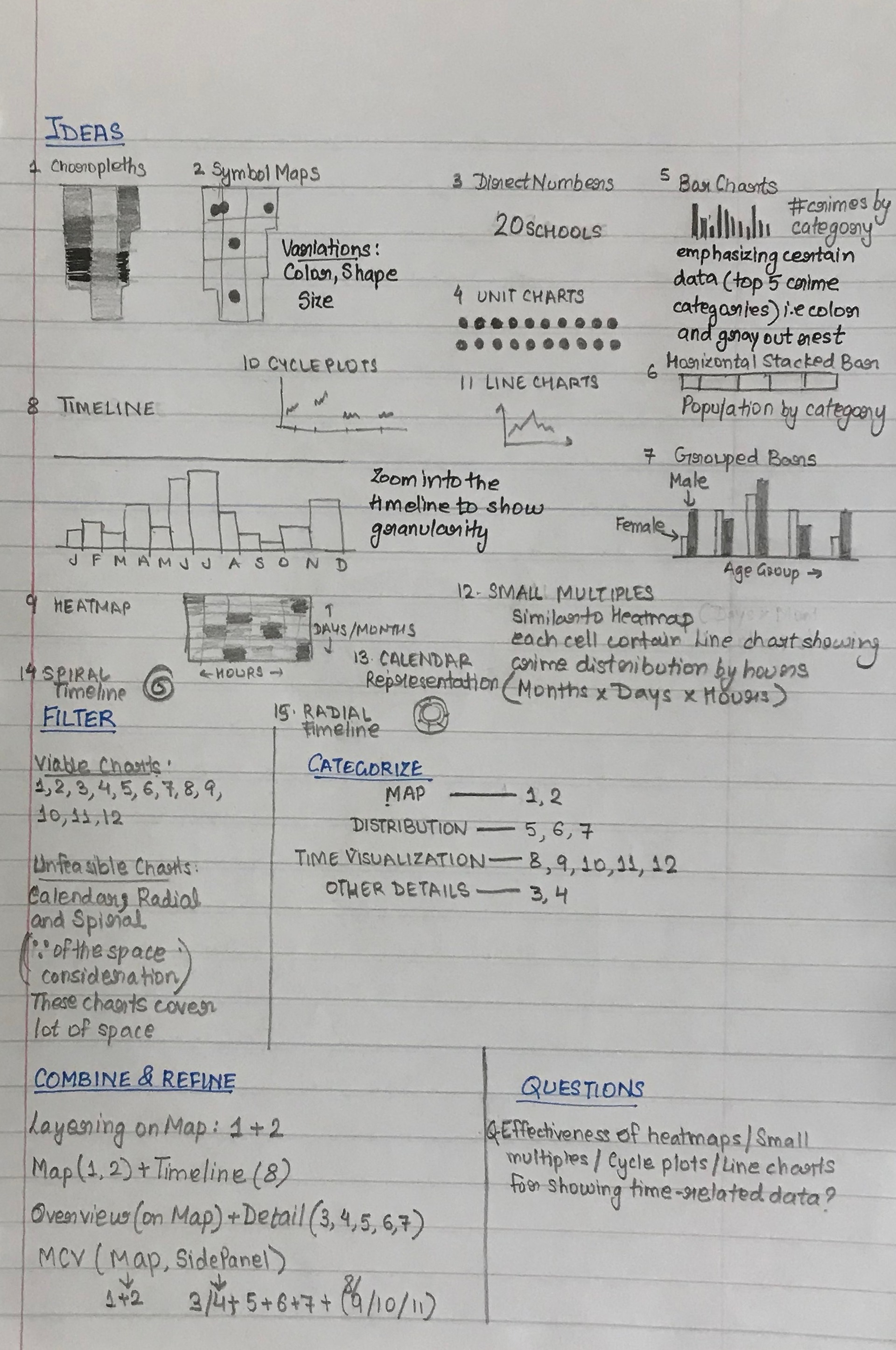
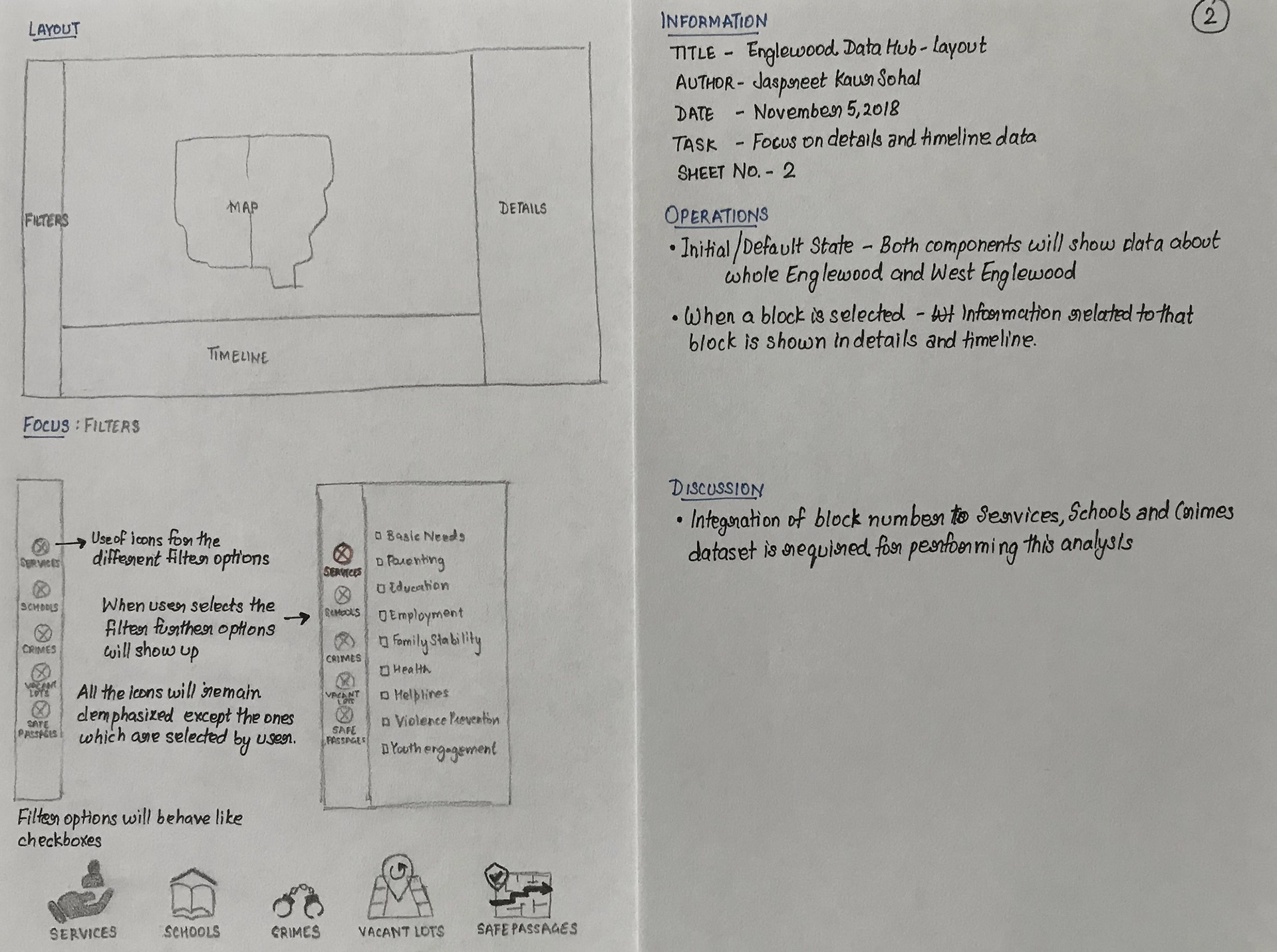
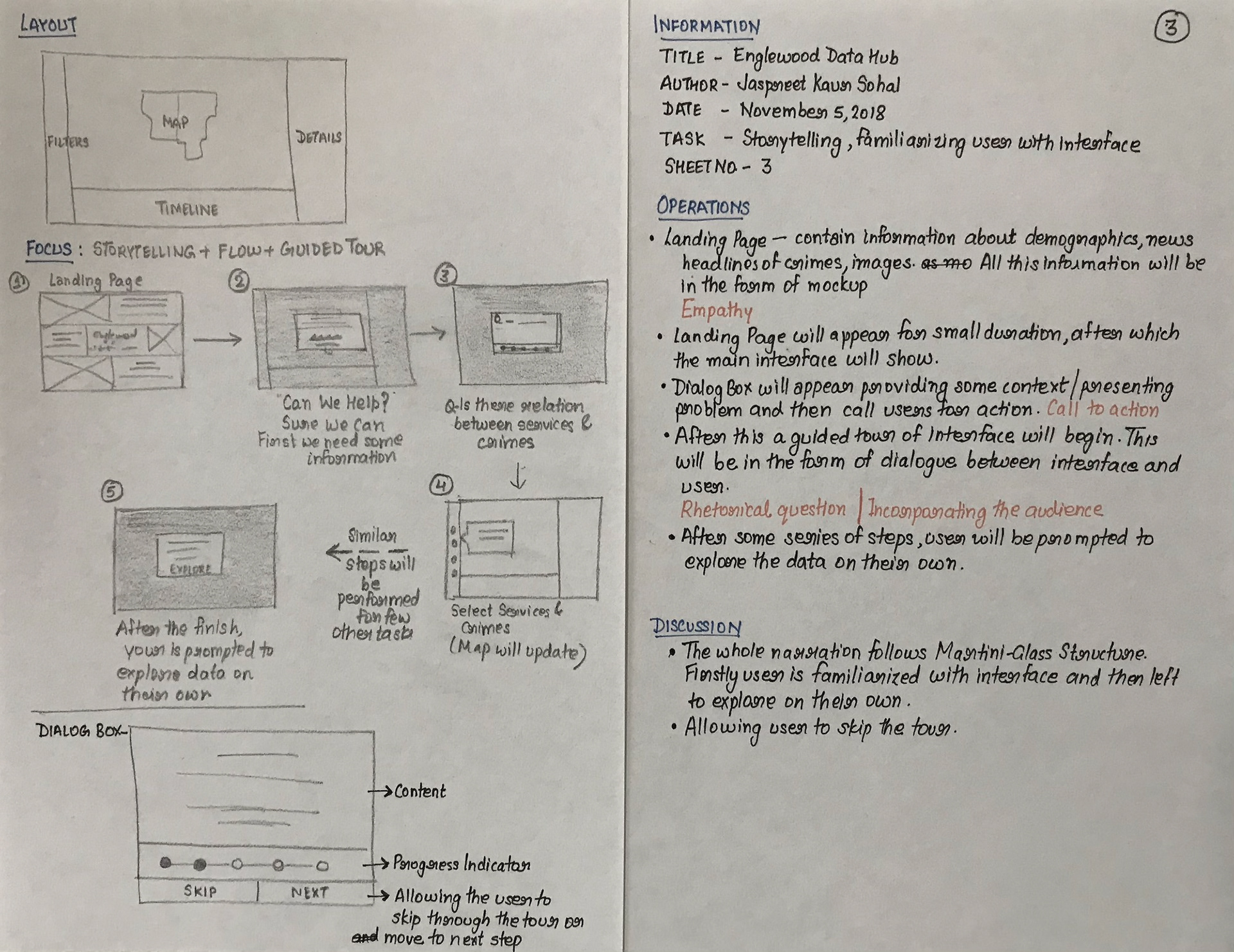
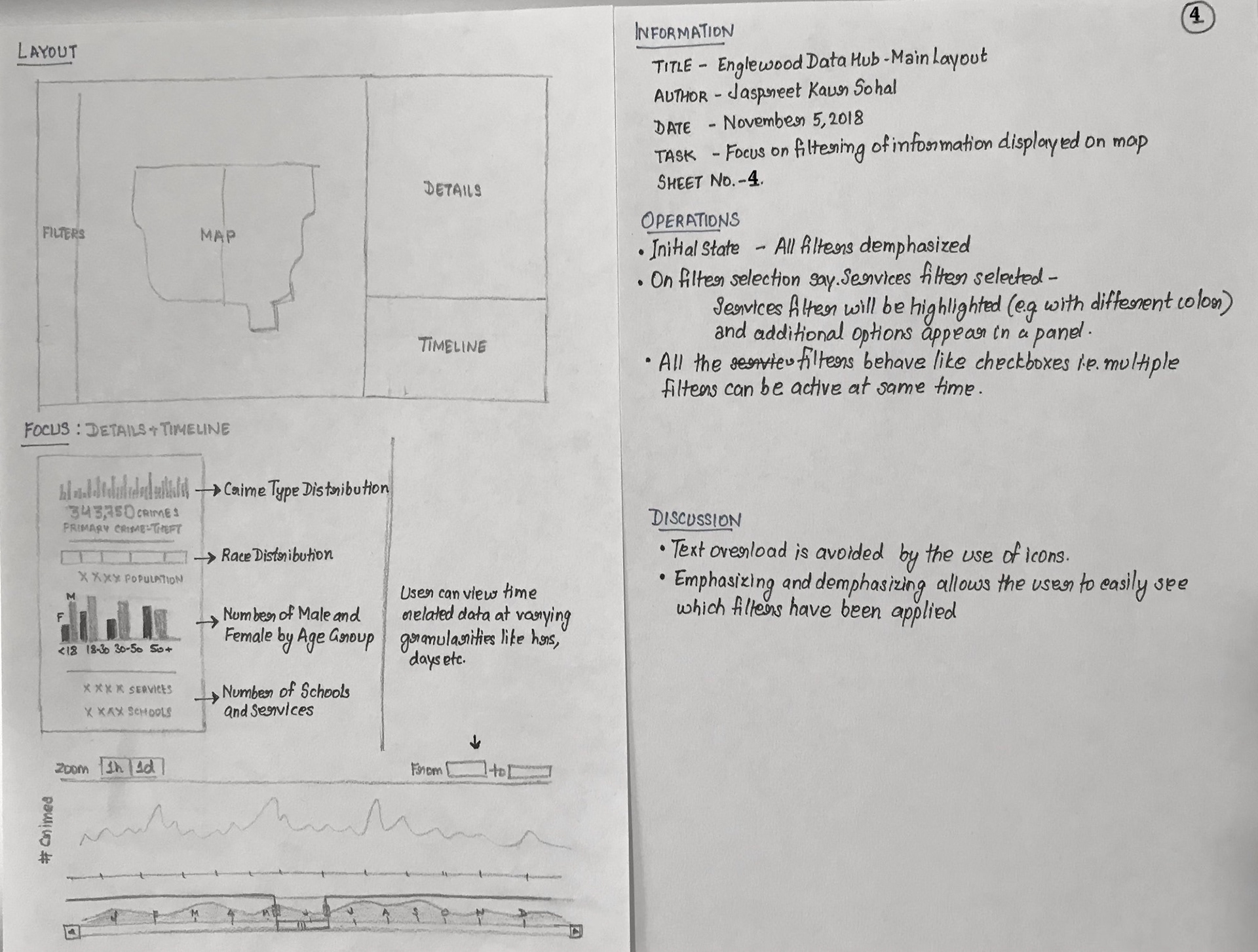
Prototypes
Prototype based on Five-Design Methodology by Jonathan C. Roberts
Alpha Release
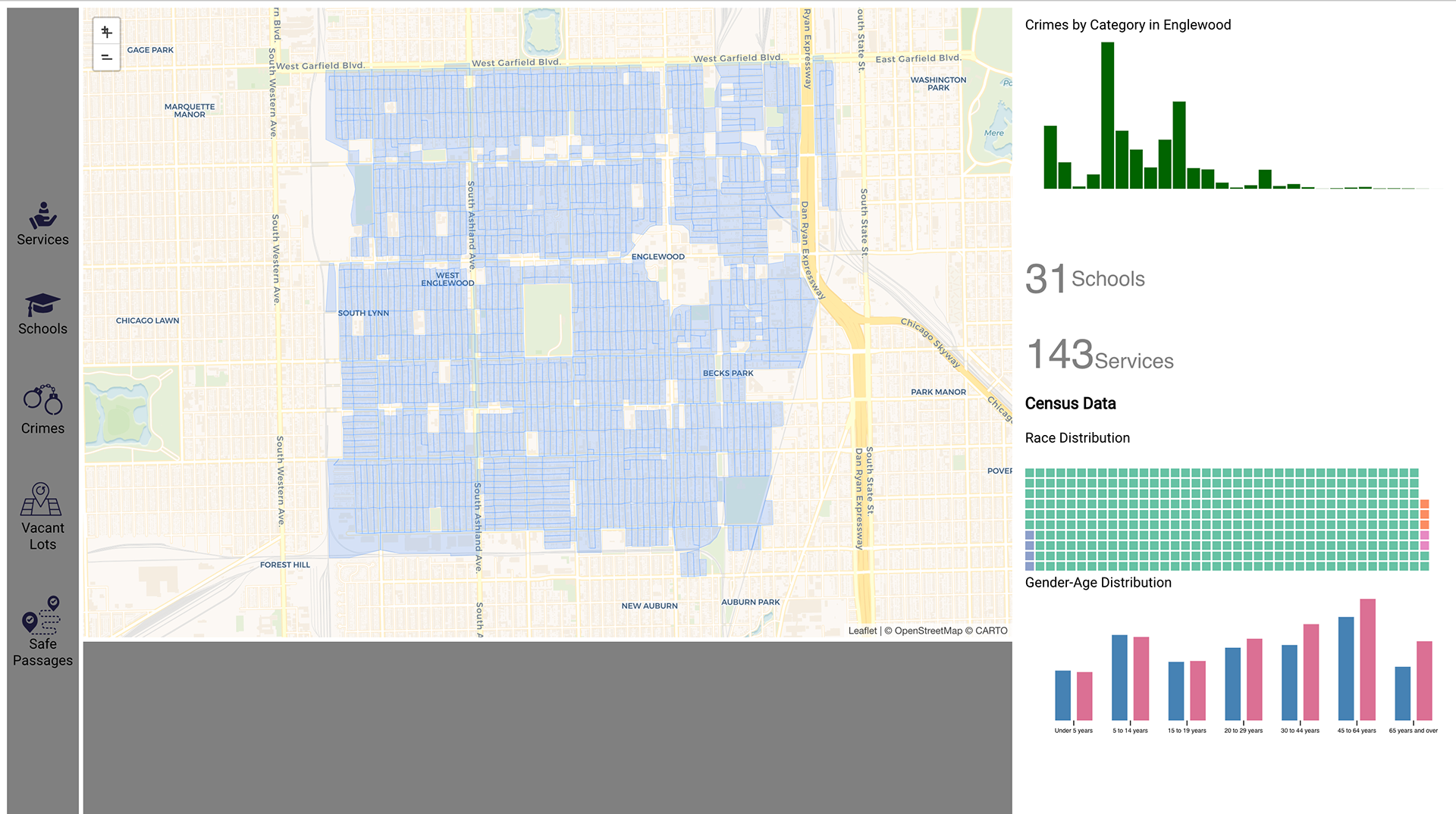
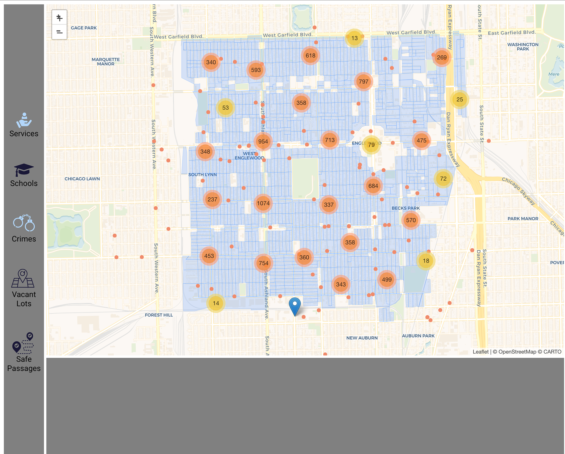
Services and Crimes
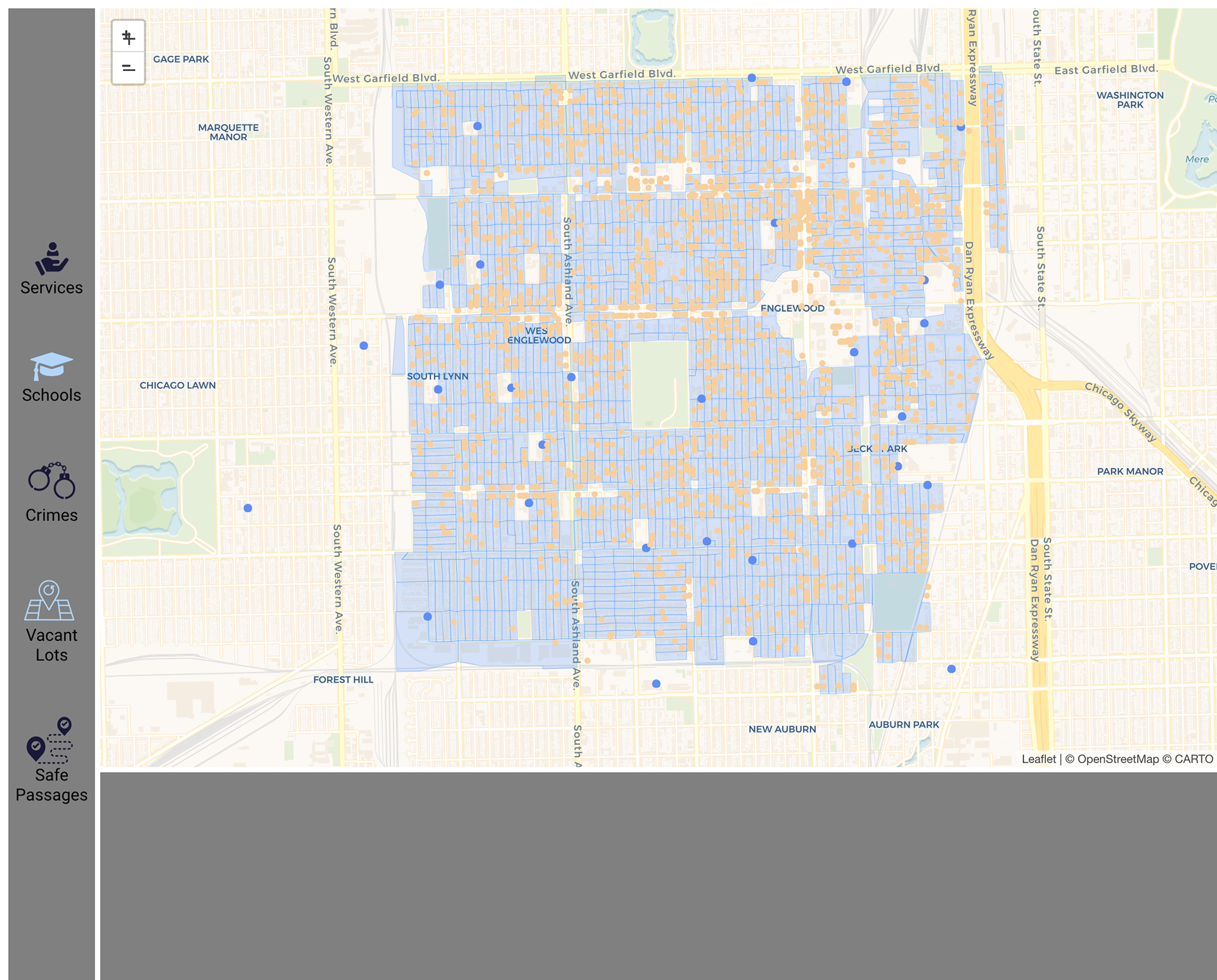
Schools and Vacant Lots
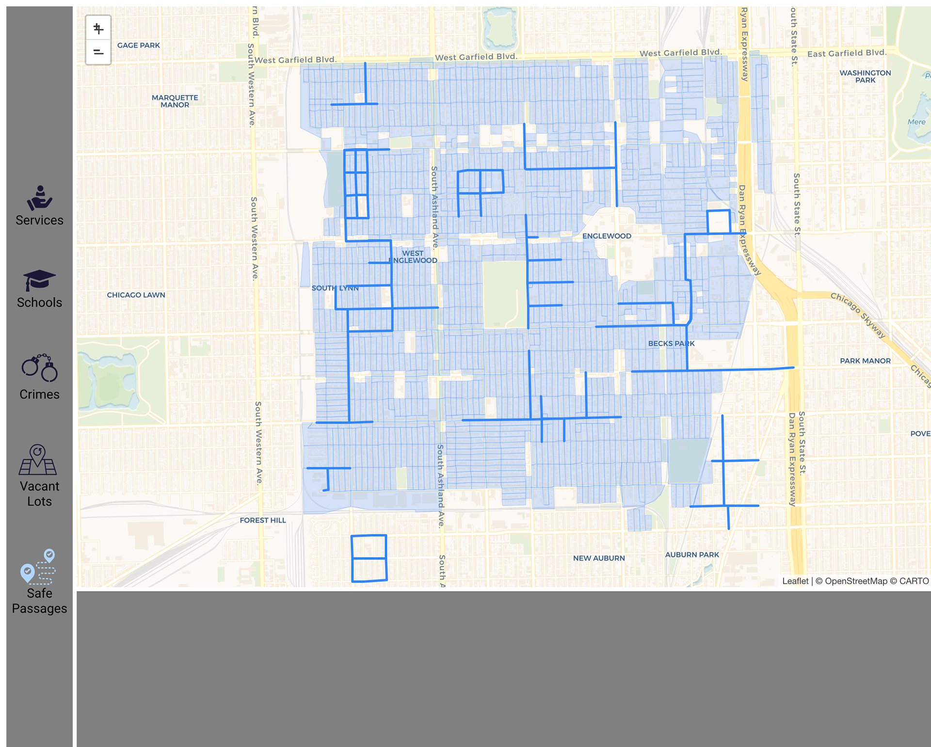
Safe Passages
Insights - Alpha Testing
Pros
Most of the users were able to easily understand the use of filter icons.
Cons
The encoding(unit chart) used for racial distribution was not evident to some users.
The time between hovering over the unit chart for race distribution and showing the tooltip was too large. So most of the users had difficulty in determining the dominant race as the tooltip did not show immediately.
The details panel included charts that changed depending on the blocks selected and also charts that represented statistics for the whole of Englewood which remained static when different blocks were selected. This information could be structured in a better way so that it does not confuse users.
Beta Release

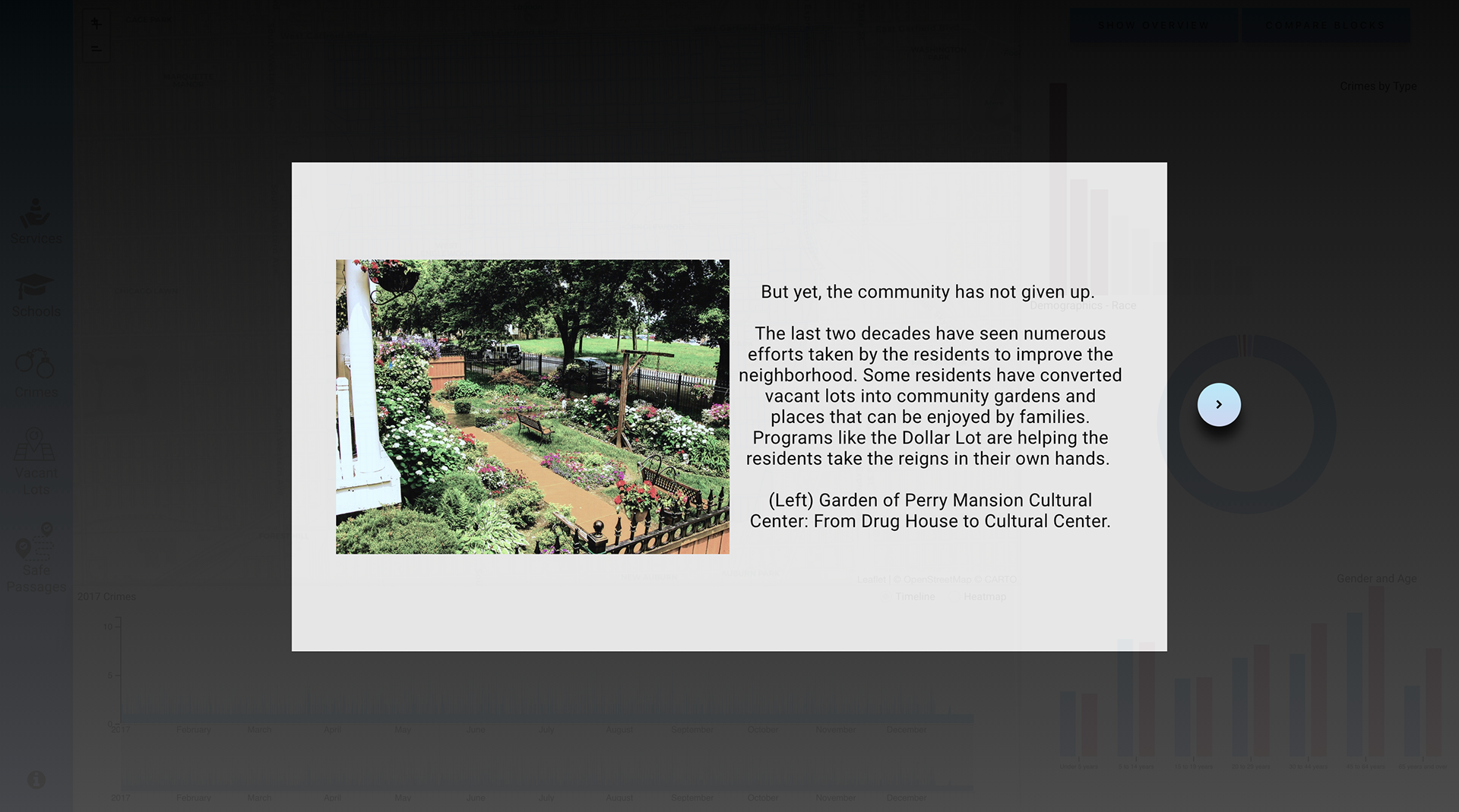
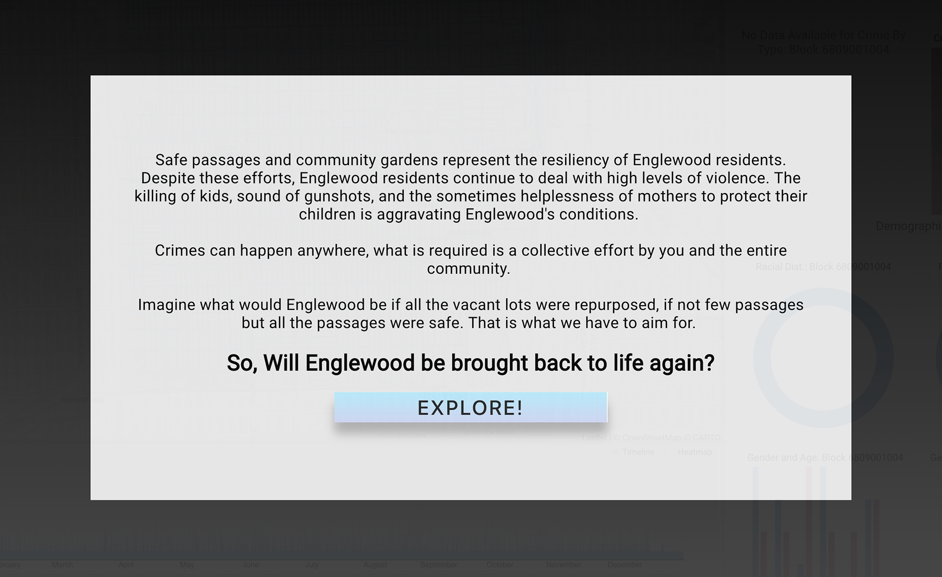
Story Cards
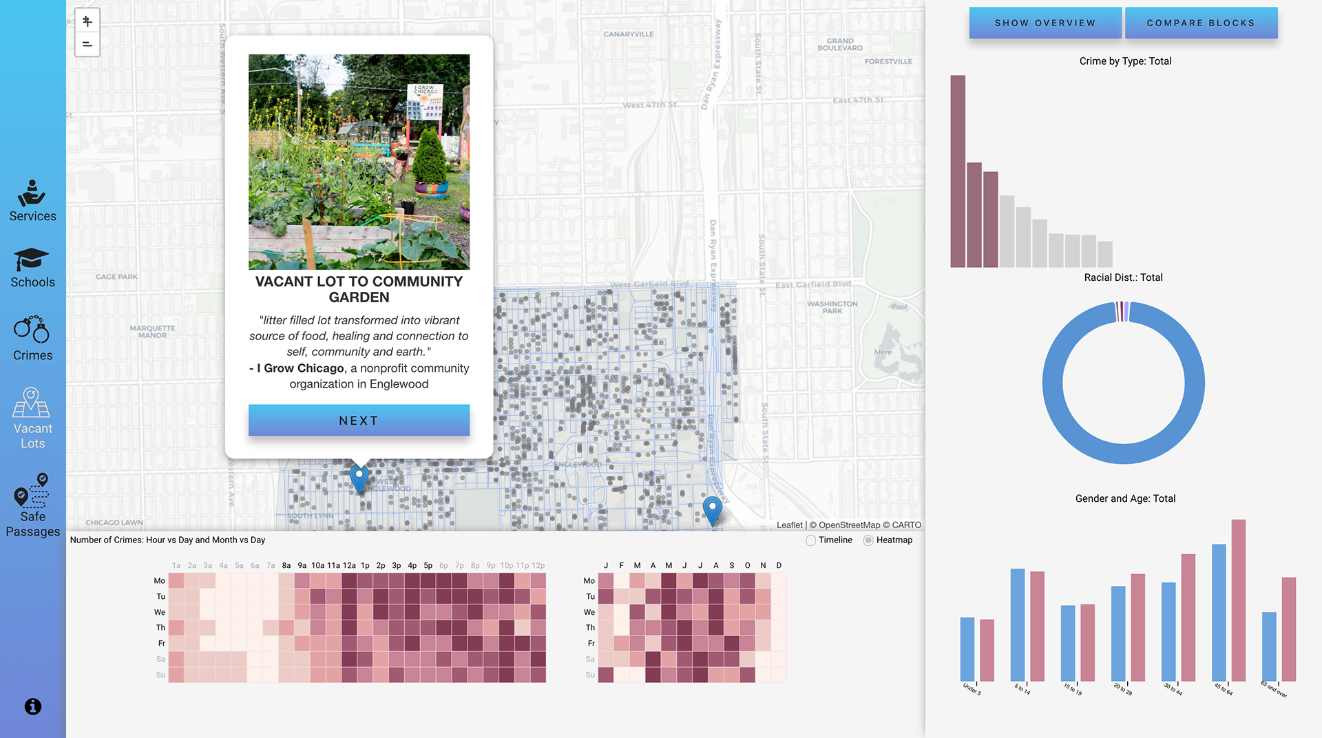
Story Popups that appear during Storytelling

Filters
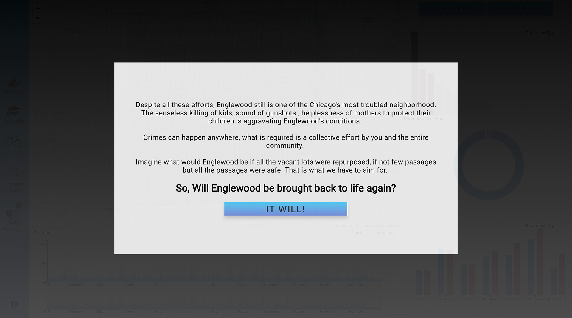
Last step of Storytelling Phase
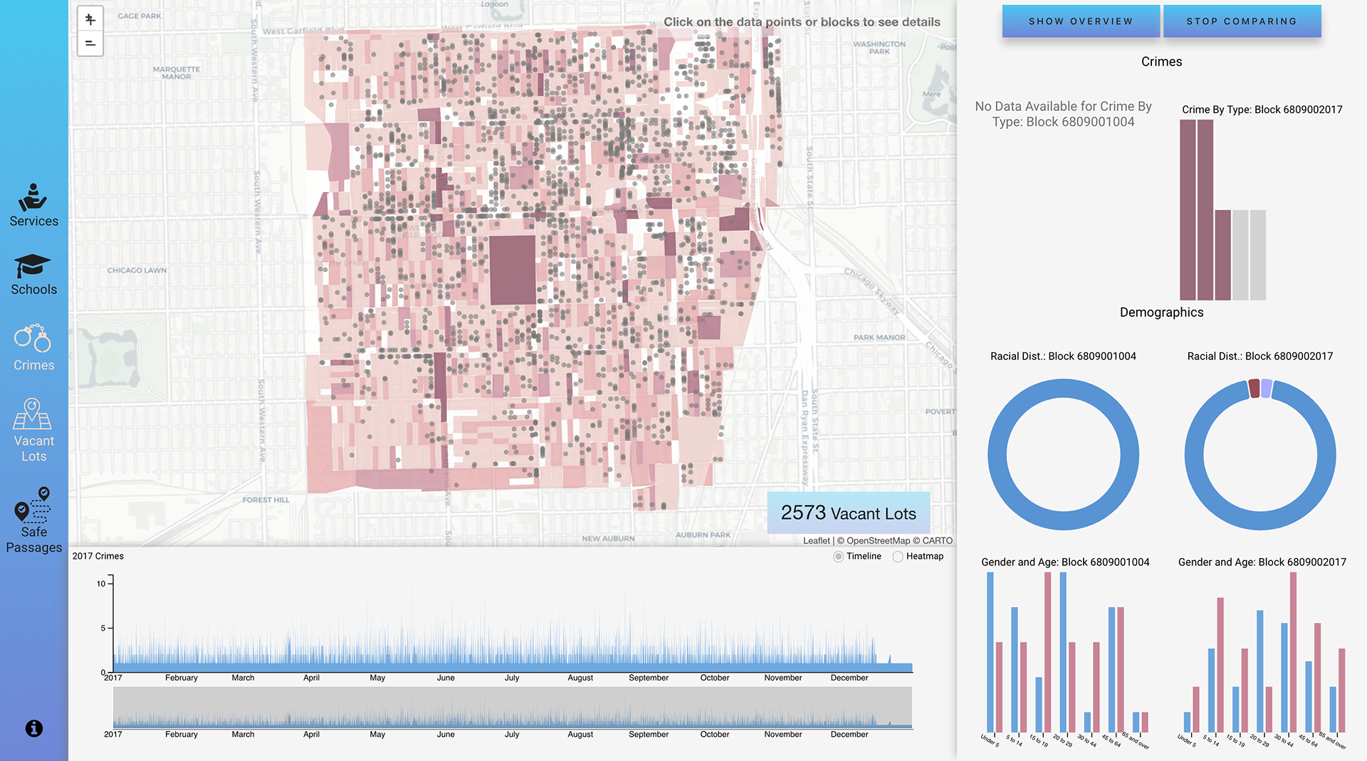
Comparison of blocks
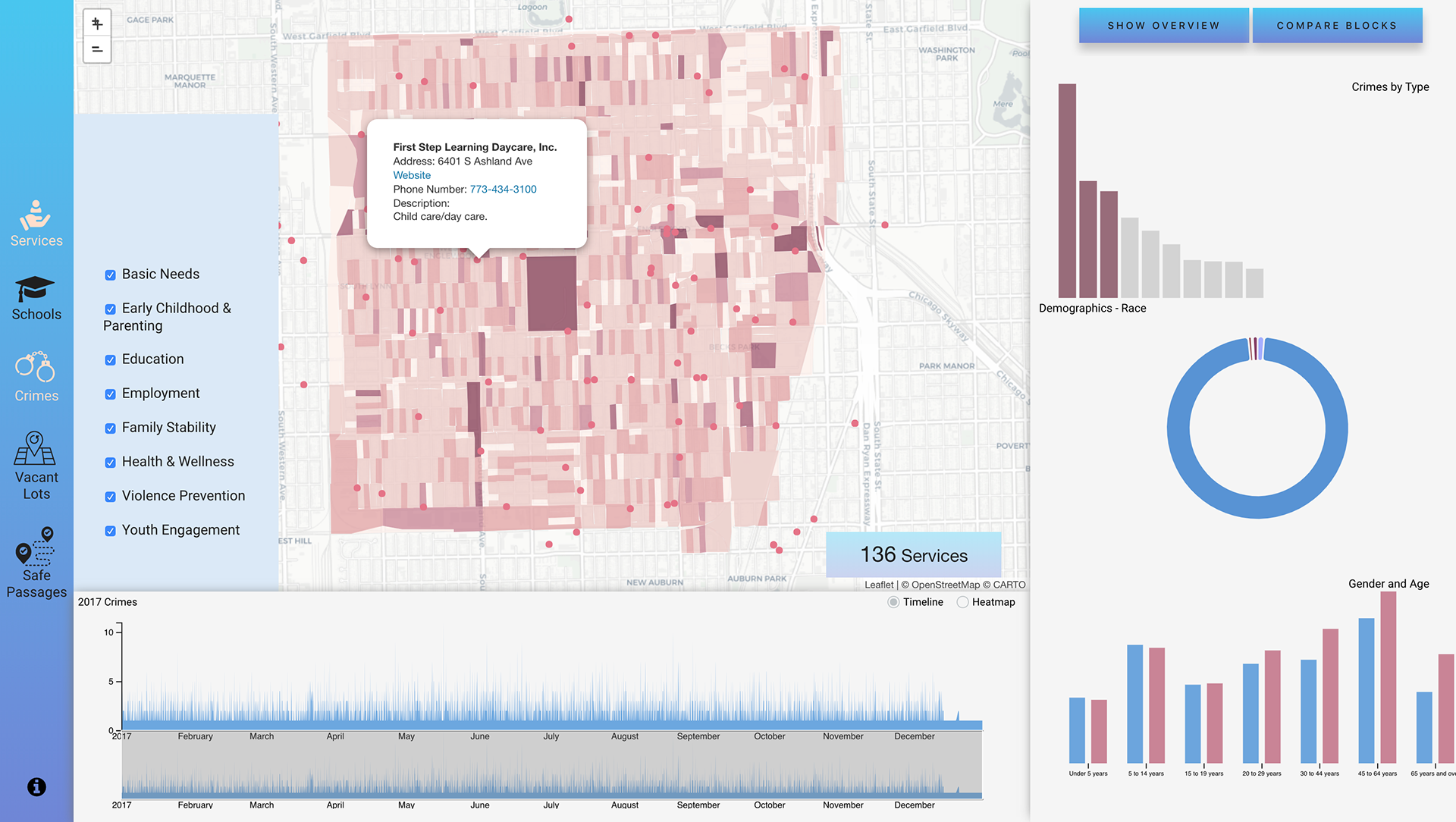
Services and its Types
Insights - Beta Testing
Pros
All the encodings are easy to understand by the users.
In alpha version, the unit chart encoding of the racial distribution was confusing to most of the users and users spent lot of time in performing one task. In beta version, the encoding was changed to donut chart and the users performed significantly better.
Cons
The layout of the details panel needs to be fixed as some components appear out of place.
Public Release
Rephrased the contents of the Last step of Storytelling
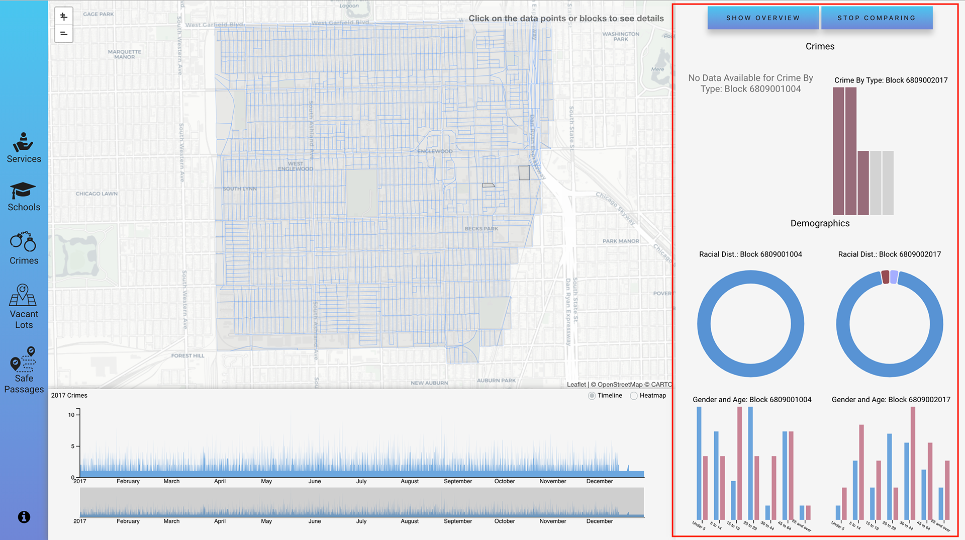
Comparison of blocks
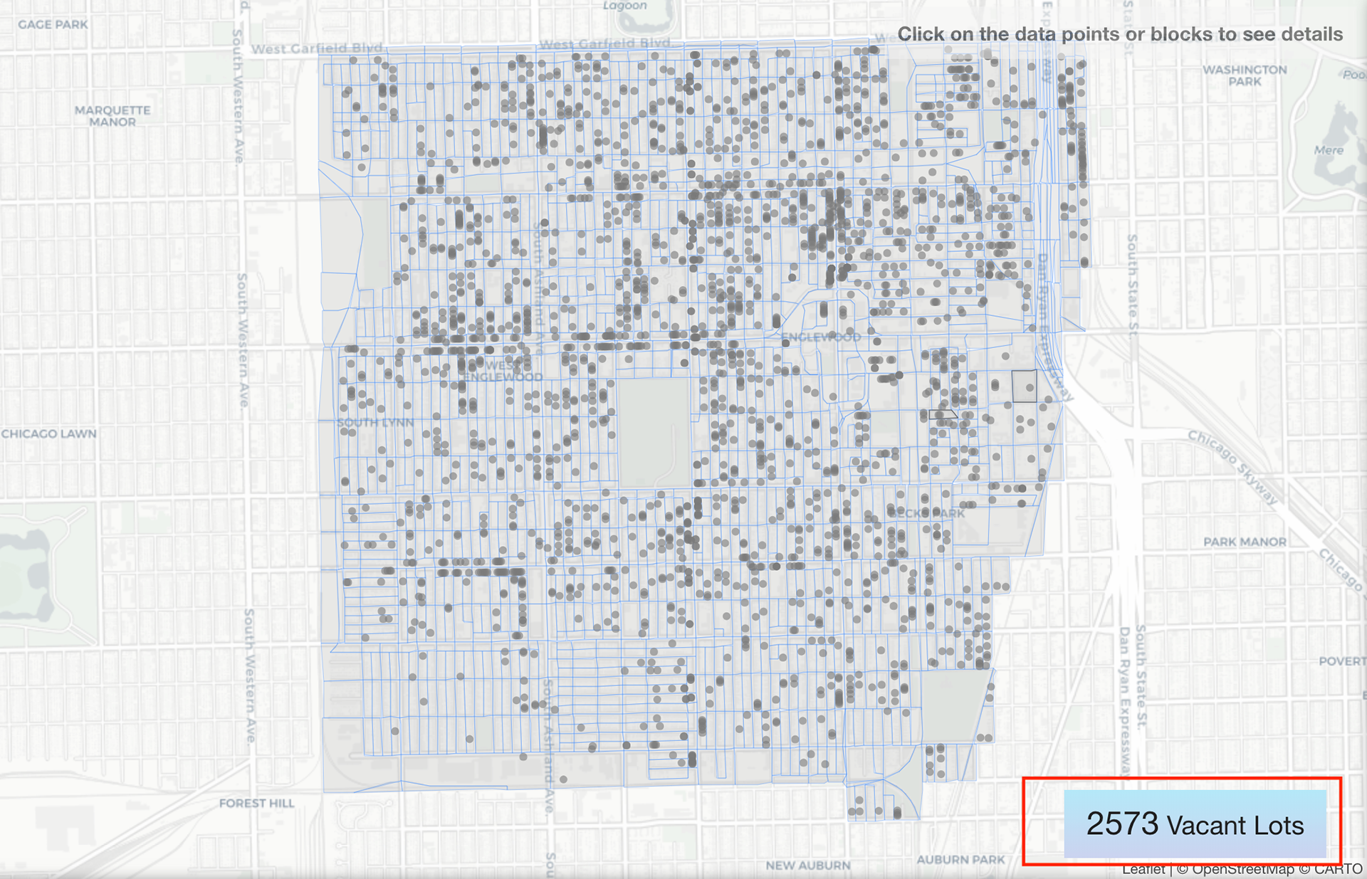
Number of Vacant Lots Info added
About Section added
Clients
Professor Ruby Mendenhall - Associate Professor in Sociology, African American Studies, Urban and Regional Planning, and Social Work at the University of Illinois at Urbana-Champaign.
Kiel Gilleade - Research Programmer at National Center for Supercomputing Applications, University of Illinois at Urbana-Champaign.
Joshua Castor - Undergraduate Student at Electronic Visualization Laboratory, University of Illinois at Chicago
Client Feedback
Pros
Easy to use and informative map display for various filters like schools, services, vacant lots, crimes and safe passages.
Appreciated the story elements being used including the images of the landing page and the narrative popups that appear during the storytelling phase.
Points for Improvement
Currently the crimes data include all the crime types of different severity levels which could be further filtered down for better insights.
Although Block level comparison is a novel feature but it needs improvement in terms of how the data is being displayed.
Team
Jaspreet Kaur Sohal (Project Lead)
Sai Phaltankar