How it works?
The visualization uses Shneiderman's mantra: "Overview first, zoom and filter, then details on demand"
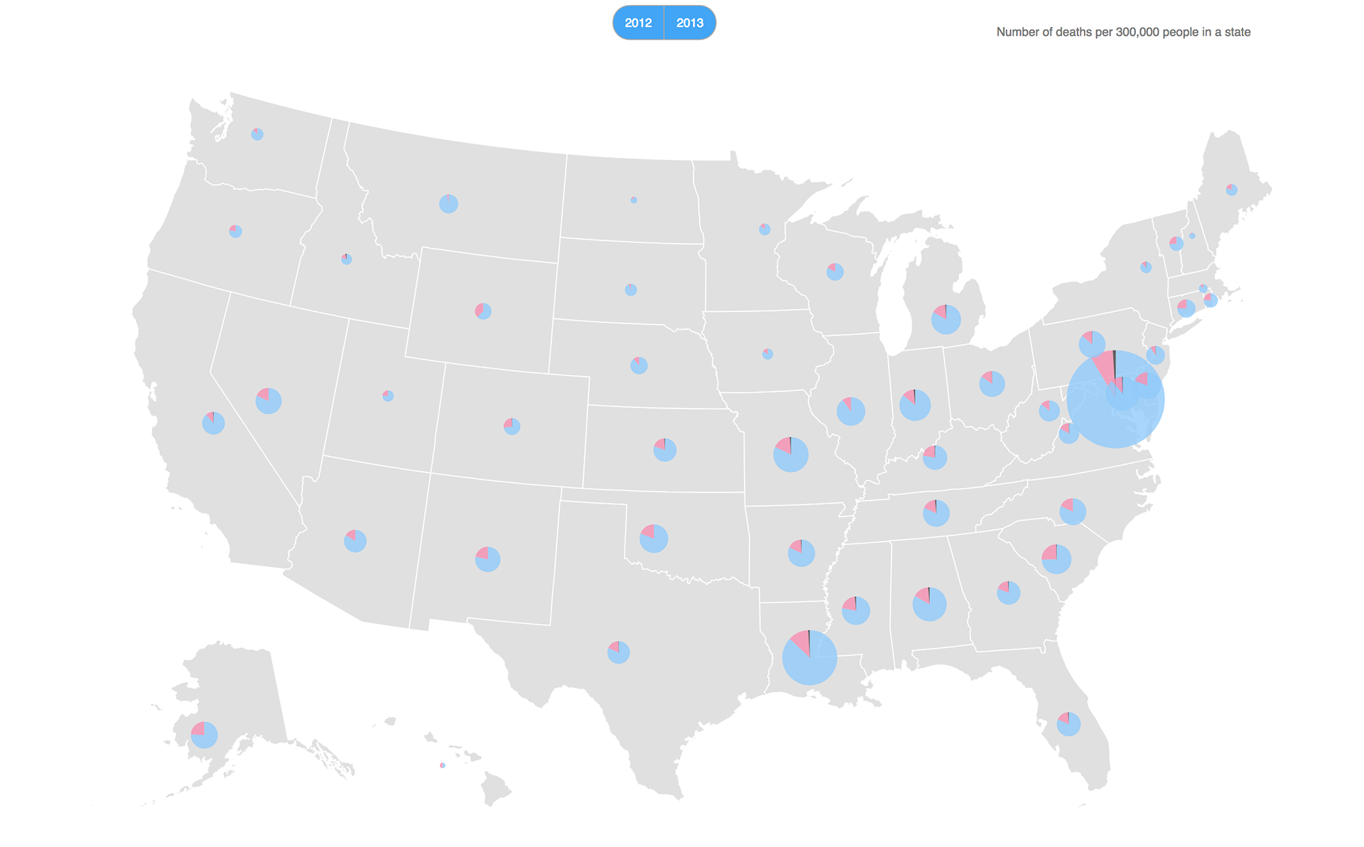
Firstly, the overview of gun deaths across different states is provided which has been normalized by population. Size represents the number of deaths and wedges of pie corresponds to the number of male, female and unknown deaths.
Next user can select a state. The visualization will zoom into the state and provide city data filtered for that particular state. Selecting the state again will zoom out.
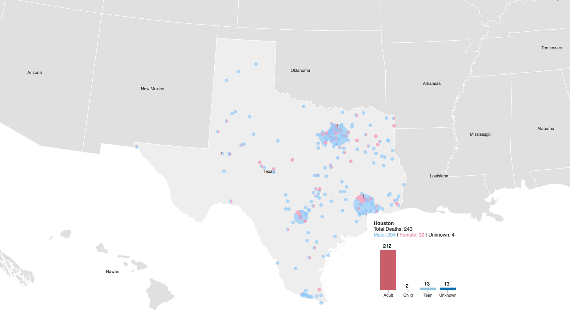
Zoomed and filtered results when a state is selected
And details like exact number of deaths, gender distribution and age group distribution are shown on demand that is when user hovers over a point or state.
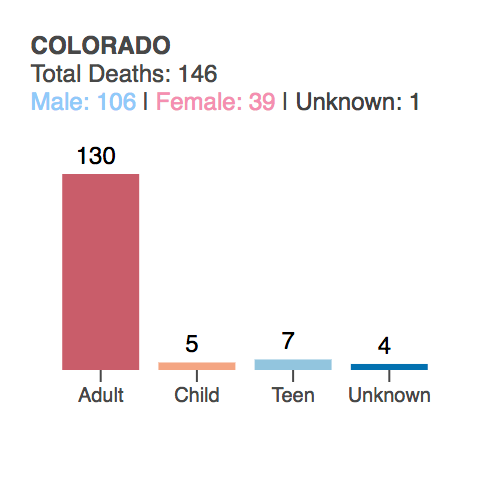
Tooltip showing data for state Colorado. The data shown includes: total deaths, gender and age distributions
Further the user can filter the data by selecting the year for which they want to see the data. Year selection options are provided on top of the map.
Data
● Data Source: Slate Gun Deaths
● Data munging involved removing discrepancies in the names used. For instance OH and oh state code for Oklahoma, FL and Fl for Florida and so on.
● Normalized the number of deaths for each state by the population of the state for providing better insights. The calculation used is as follows:
(number of deaths / average population for 2012-2013) * 300,000
That means the size of the circles in the map represents the number of deaths per 300,000 people.
The population dataset is from kaggle.
The population dataset is from kaggle.
● Age Groups are categorized into four classes:
<13 years : Child
13 to 17 : Teen
18 and older: Adult
Unknown age
● Handled the missing values: For gender, replaced blanks with 'Unknown' and for age group, all the unknowns were categorized as fourth group.
Credits
● The project is using D3, JavaScript, HTML and CSS.
● Material references for this project includes:
Lynda : D3 Fundamentals
Mapstarter: US States Map
bl.ocks: Reference examples