User Observation and Analysis
Had an extended back and forth dialogue with the users of various IoT devices, to understand their needs and goals and any other important information.
On interviewing the users, it was determined that all the users had a variety of IoT devices ranging from smart thermostat, hue lights to Amazon Alexa, alarm system and even a connected car. 
Some of the requirements assessed from the interview are as follows:
● Need of a single application to control different devices rather than having different application for each device or having to interact directly with the devices
● Incorporation of the feedback system to have confirmation that something happened
● Central tool to handle interaction from multiple users, including multiple permission levels
Based on the feedback during the interviews, three user classes were defined: 
Average Users interact in consistent ways with the devices, regularly executing simple commands
Expert Users are users of above-average in technical ability, desire for customization, or reliance on IoT devices
Restricted Users have varying permission levels and are time-limited or functionality-limited
Design Scenarios, Sketches and Storyboards
We wrote Scenarios for each of the User Classes. We thought this is necessary because different user classes may wish to execute some of the same high-level tasks, however, they may do so with different motivation or through different means. For the Storyboards, we focus on one Expert User Scenario because the Expert User Class has the broadest set of high-level tasks. The Average and Restricted User Classes contain a subset of the Expert User Class. Therefore, if an interface can effectively and efficiently support an Expert user’s tasks, it will also support the other two user classes.
On the basis of scenarios, each team member generated sketches of the interface.
Here are my sketches for different scenarios:

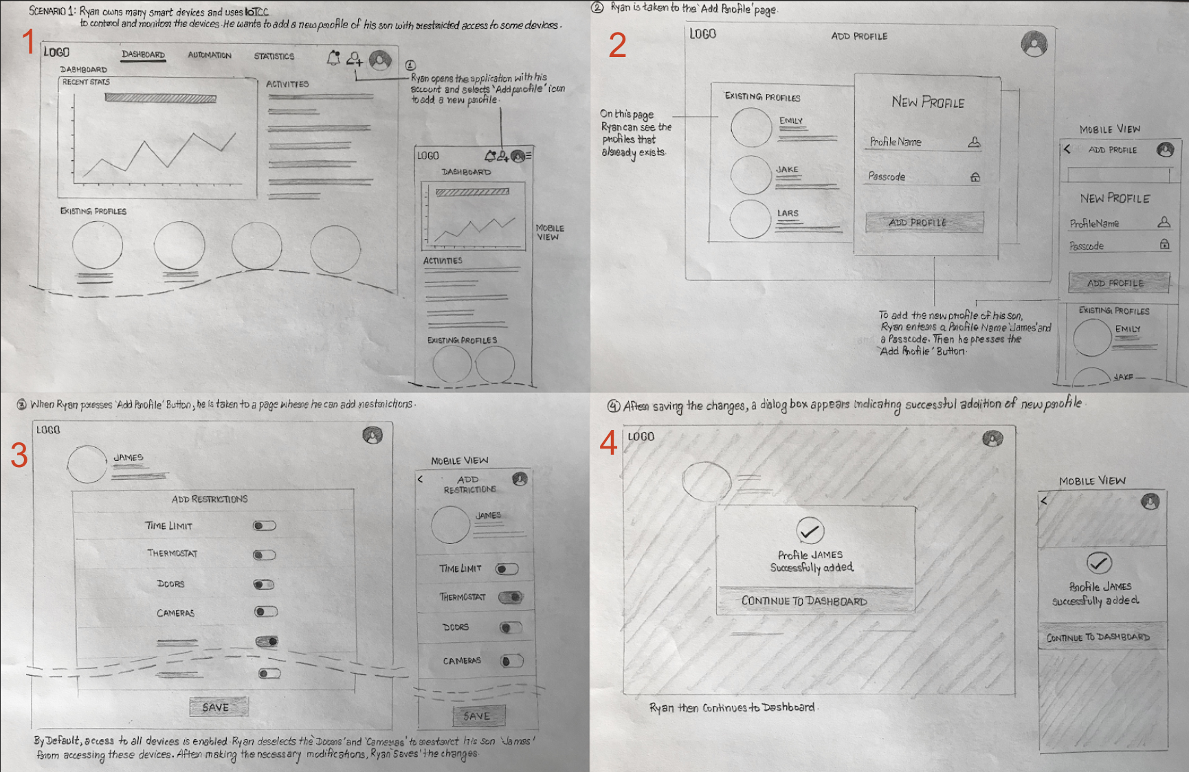
These sketches represents the flow when user wants to add a new profile with some restrictions which can be time restrictions or restrictions to access devices.

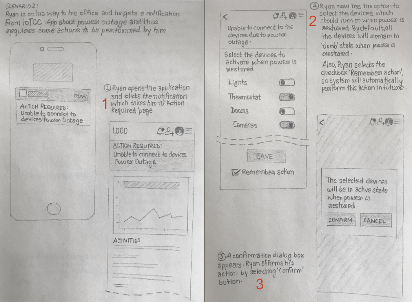
The main task shown in these sketches is how user handles the power outage or connectivity issues. The user will be provided option to choose which devices will be in active state and which should remain inactive when normal conditions resume. Further user can mark the action he has taken to be remembered for future consideration.

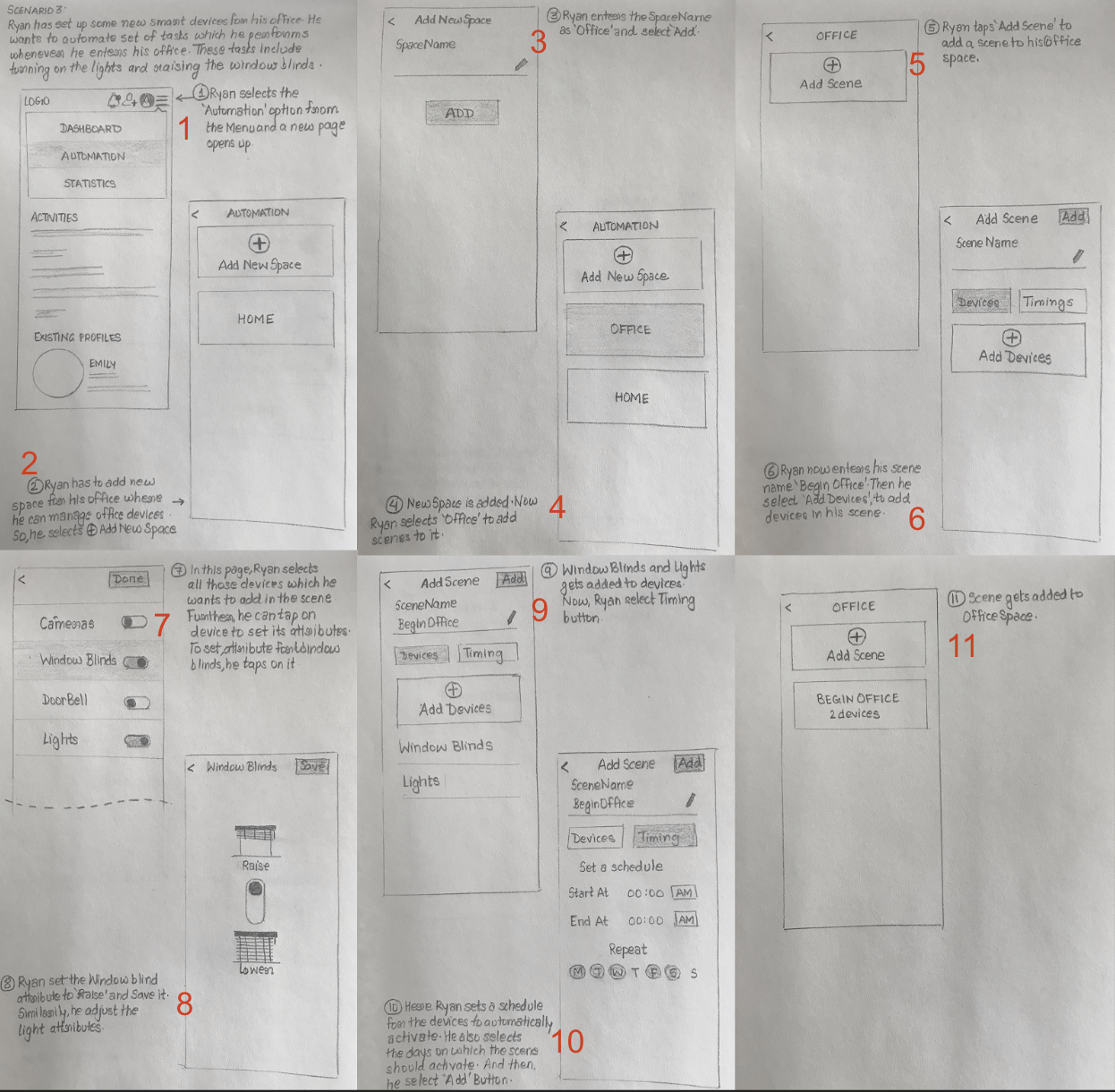
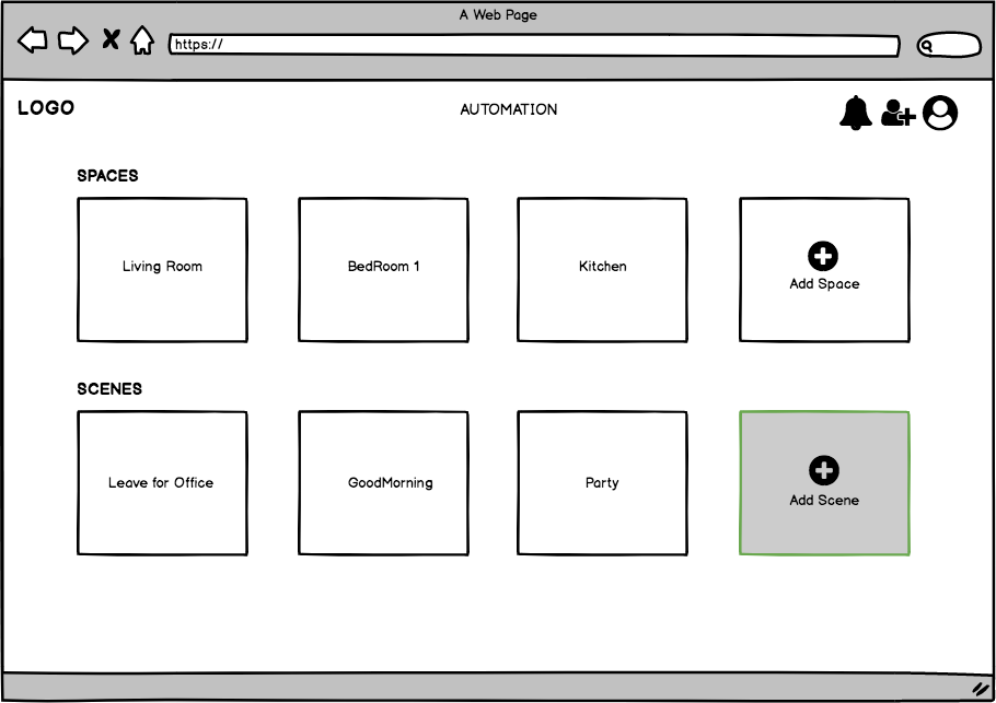
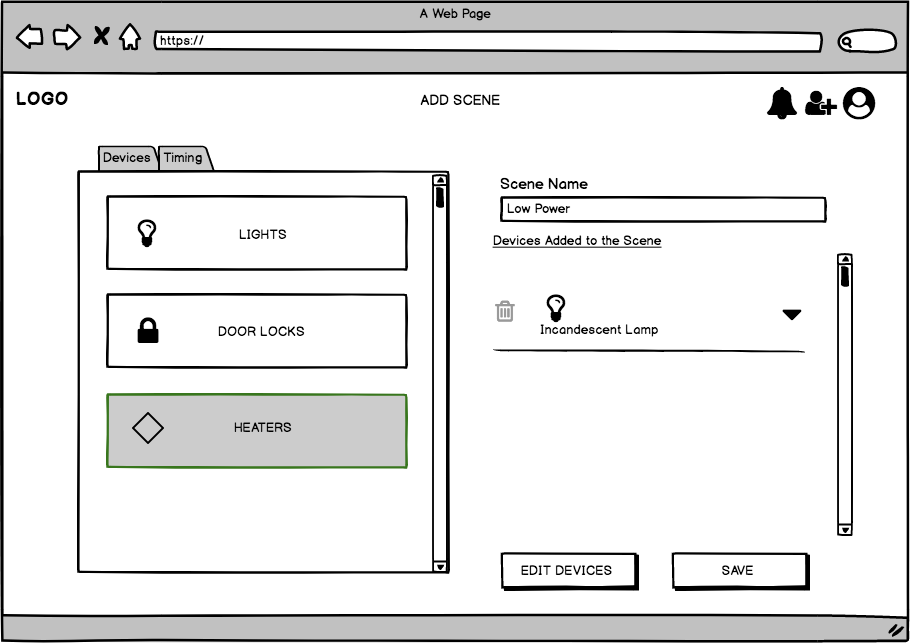
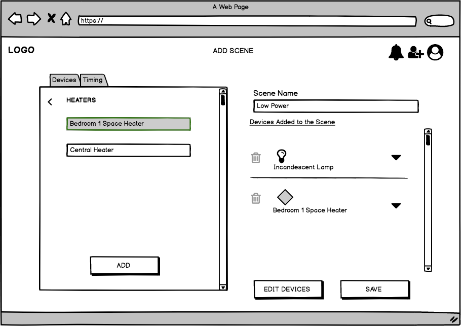
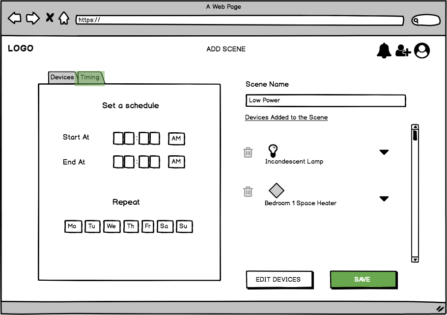
These design sketches shows the movement of the user through the process of creating a new scene. A Scene is grouping together of devices involved in routine tasks. For instance, when user reach office he/she turns on the lights, adjust thermostat and raise the blinds. Grouping together of these activities forms a ‘scene’. User can also set a schedule when the scene should be activated.

Individual Sketches Discussion Outcomes
This is a list of features which we identified as important to include in the final design from our group discussion regarding our individual sketches:
● Shared Landing page - Graph Overview.
● Grouping done based on rooms/scenes.
● Scalable & customizable rooms/scenes.
● Maximum icons usage.
● Hierarchical structured approach.
● Support for multiple workflows.
● Re-ordering Devices.
● Graphical breakdown of resource usage at every level.
Storyboard
Storyboard that was considered on the basis of discussions is as follows:
To improve the efficiency of his house, Ryan logs onto his IoT Command Center and navigates to the Analytics page. He looks through his devices and identifies the devices which are using a large amount of power including his old incandescent lamp, as well as the space heater. Next, using the information he gathered from the Analytics page, Ryan navigates to the Scenes page and chooses to create a new scene named “Low Power.” From here, he selects the identified “high power-usage” devices and adds them to the scene. In the scene editor, Ryan chooses the “off” state for all added devices. After Ryan completes the Scene customization, he confirms his choices and can begin to use this scene for meta device control when he wants to quickly reset his house to low-power mode.
Three different storyboard designs were generated. The following sketches show one of the storyboard:
Paper Prototyping & User testing
We decided to go with the design shown above. We printed our designs and interchangeable pieces for the Paper Prototype User Testing. This choice was motivated by the reusability of components.
Scenario Tasks
We provided these tasks on notecard to users as they progressed through their User Test.
Assumption: There is an existing configuration of devices.
● View electricity usage data and identify two devices with the highest power consumption in the house
● Create a new Scene (a configured state of devices) named “Low Power” which includes the devices with high power usage (incandescent lamp and space heater) in the OFF state.
● Use the control panel to set the house to the new “Low Power” scene
We performed 3 iterations of the design with 2 rounds of testing. After each iteration we improved the design on the basis of the user observations and the feedback.
Prototype Iteration 1 and Impressions after (3) user tests:
Poor Organization - We have some problems regarding our hierarchical organization of information on the Dashboard and Statistics pages — the relationship between elements is shown to be unclear.
Low Visibility - The prominent pages/tabs of the tool in the navbar are not apparent to the users — they look towards the large room buttons before looking to the navbar.
Unclear Terminology - The terminology should be cleaned up to better imply functionality within that interface component or page/tab.
Low Efficiency - Rearrange the Scene creation behavior to require less operations.
Overall, streamline task completion by simplifying interface components as well as interface behaviors between actions.
Improve fidelity of next prototype iteration to leave less artifacts from the software used.
Prototype Iteration 2 and Impressions after (3) user tests:
The Activate Scene functionality was very unclear to all users. The relationship to the “Off” labels beneath it was not apparent, and the difference between the device State switches vs. the “Scene Activation result” was hidden.
The buttons vs. labels in the design (resembling Bootstrap styling) should be more strongly differentiated.
The organization of information is much better than before, but some parts may have been too dense, causing confusion. 
Improved Efficiency - Compared to the previous iteration where functionality was scattered across 3 separate panels, this iteration had statistics, available scenes/rooms, and current devices all on one panel. It took 3 less clicks to create a scene compared to our previous iteration.
Simplicity - The second iteration of our paper prototype increased simplicity in  terms of separate pages, however, the simplicity was also reduced in another dimension due to the increased density of this design. Some users were a bit slow to map out the functionality in the beginning of their tests.
Visibility - Although the interface was dense, the functionality contained within each panel was readily apparent to users. For example, when User 1 clicked on “Add Scene”, she immediately understood that resulting new window allowed her to add a new configuration state and select which devices to include in that state.
Final design after prototype iterations

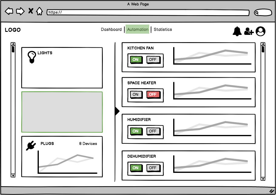
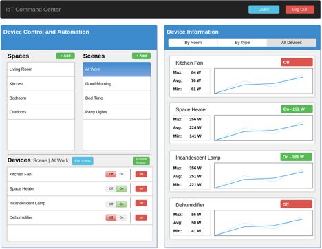
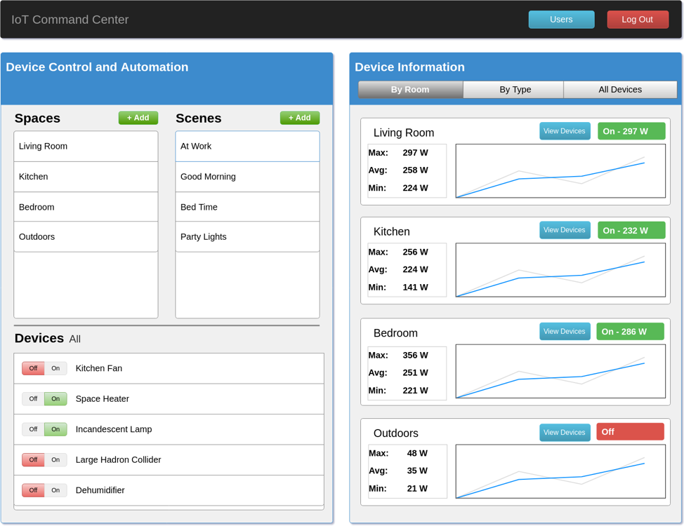
Start Screen: This is the screen which a user is shown when they open the interface — the default state. The interface consists of 2 panels: the Device Control and Automation panel and the Device Information panel. All of the functionality is grouped into one page to retain contextual information while performing automation-based tasks. The graphs in the prototype are placeholders (identical to one-another), so the min-avg-max and current power usage numbers are used to compliment the time-series. In the Device Control and Automation panel, users can explore and control devices by Space or Scene. For completeness, we include a list of all devices to scroll through without having to select a space or scene.

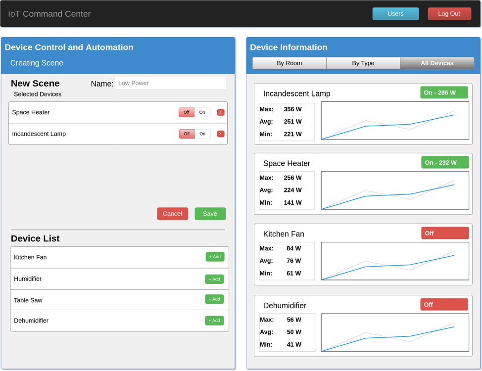
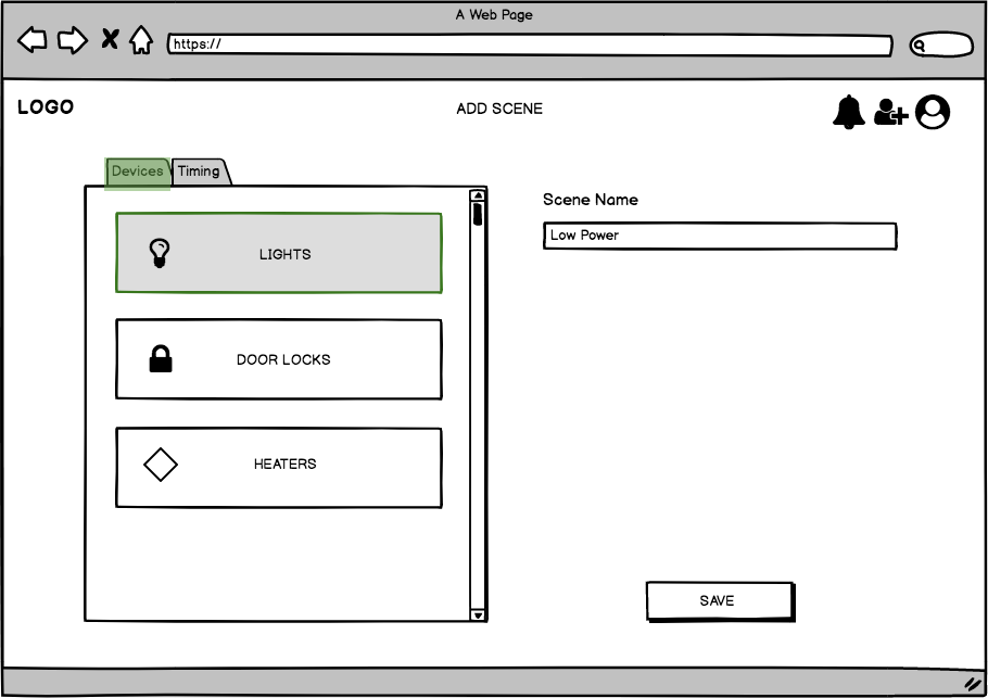
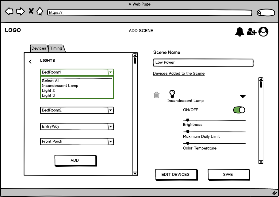
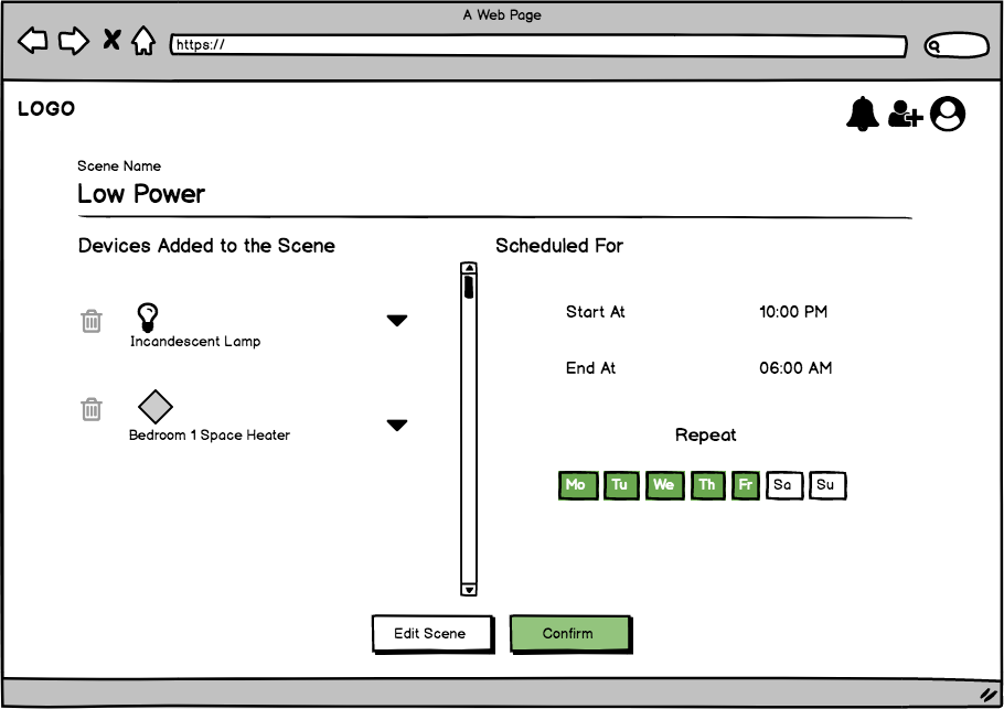
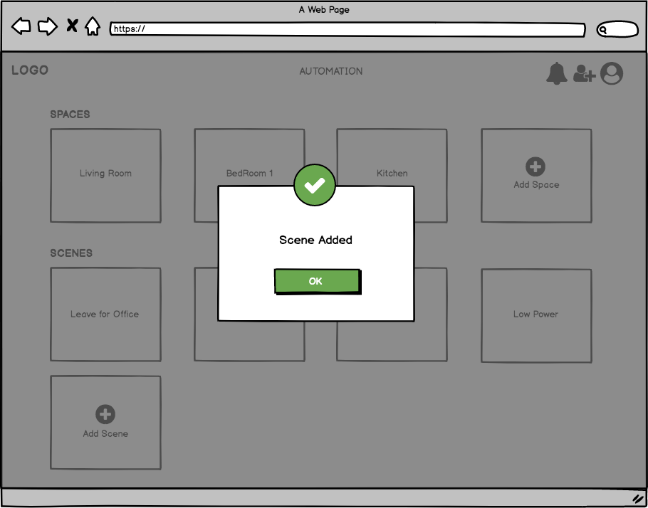
Adding a Scene: When a user chooses to create a new scene, the contents of the Device Control and Automation panel are replaced with the Creating Scene interface. We elected to use this as opposed to a completely new page as to retain the contextual information in the Device Information panel. The groupings or power usage of devices could be important information while customizing Scenes. Devices from a list of devices at the bottom of the left panel can be added to the New Scene and the states can be customized between devices. Once the new Scene is named and the devices are added and configured, a user will select Save, producing a confirmation dialog.

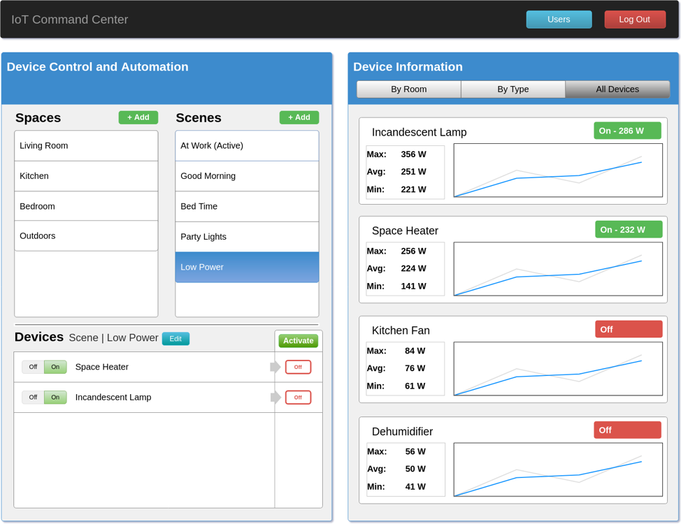
Activating a Scene: When a user selects a scene (or a space) the devices within that grouping will be displayed at the bottom of the panel. A user can inspect the state of the devices in the group and change the state using the switch on the left. For a scene, the user can “Activate” the scene, setting the devices to the specified states in the scene. To maintain visibility, we choose to display the state transition for devices for when the Scene is activated.

Computer Prototyping
We choose to design our system to be web-based, attempting to increase portability through this decision. For development, we used the React web framework (using JSX syntax). Development requires node.js and installing supplemental modules locally.
Heuristic Evaluation
The heuristic evaluation of the computer prototype yielded following issues:
Limited User Controls: no options available to select “All Spaces” or “All Scenes”, no sorting or filtering available for data and devices
Additional Visibility: can’t tell which scene is active without going through them one by one
Scenes Metaphor Learning Curve: some users don’t realize that scenes are a set configuration state and cannot be turned off
Bug Fixes: some visual glitches with graphs in edge cases (small screens, phones, etc)
Safety and Error Checking: lack of confirmation pages prevents users from recognizing and fixing mistakes
By incorporating the feedback obtained, we were able polish our interface with regard to visibility, efficiency and safety as detailed below:

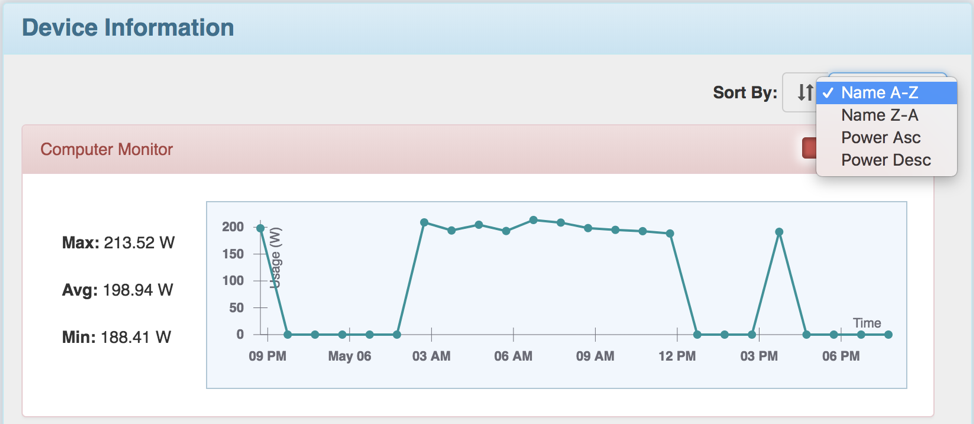
Sort By functionality enhanced the efficiency by providing the user flexibility to order the devices either alphabetically or on the basis of power consumption.

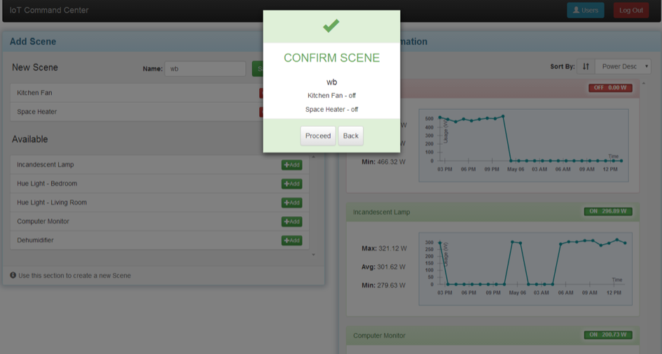
The Confirm Scene dialog was added to allow users to review, make corrections and prevent user error, which was one of the criteria of the heuristic evaluation checks that wasn’t met.

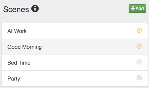
Some of the features implemented to improve the visibility of the application includes providing feedback to user in the form of confirmation pages, adding icons showing the status of the scene(active/inactive).

Furthermore, validations have been added to ensure security such as validating scene name to prevent scenes from having the same name.
Reflection
The entire process of building this interface was an laborious but ultimately rewarding endeavor. Effective parallel work throughout the project helped guide it to success. Our decision to make a major redesign of our interface after the first paper prototype proved to be very beneficial to the project. We chose to forego refining and perfecting the first paper prototype; this made it much easier to look very critically at the design and learn from it, creating a much better final design. Internalizing user feedback (both through interview and observation) proved to greatly improve our design process, converging towards a better design more quickly.
Team 
Liyuan Chen, Niharika Sakuru, Jaspreet Kaur Sohal, Andrew Burks, Rozmina Lakada
Back to Top