
Navigation Sidebar of the application
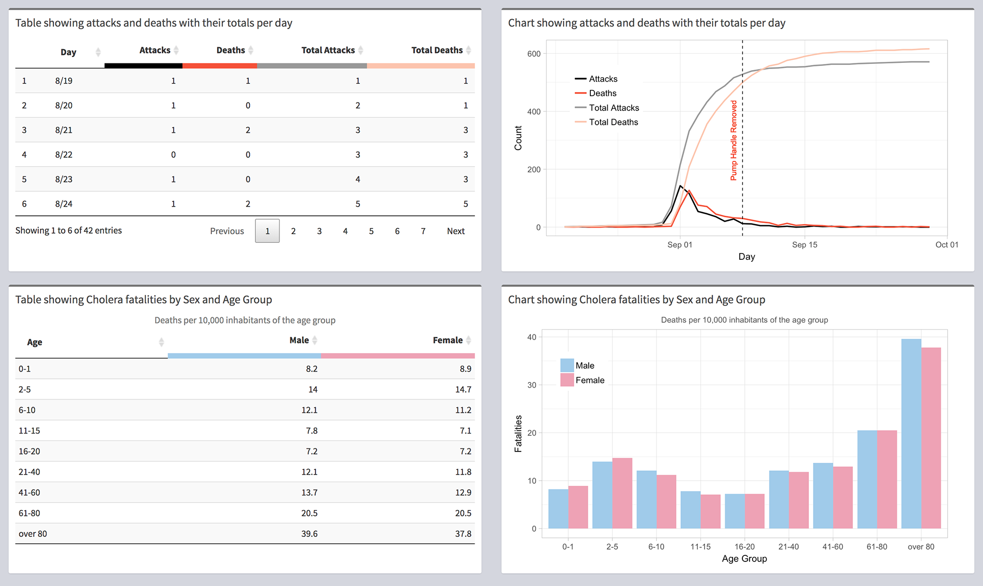
Charts and tables showing the data for 1854 Cholera Outbreak in London
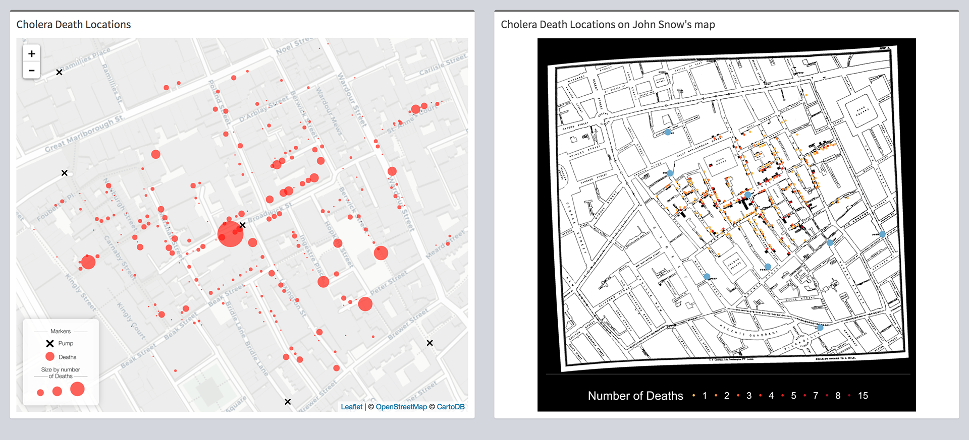
Maps showing death locations of Cholera fatalities
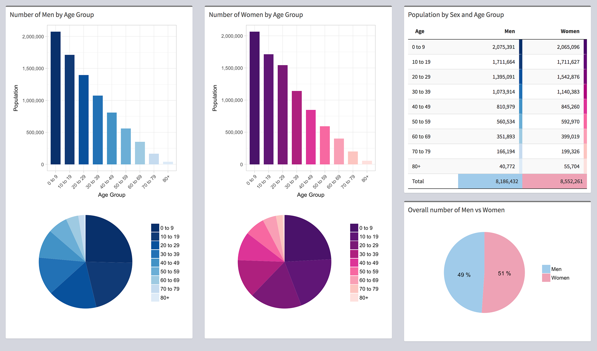
1851 UK Census Data
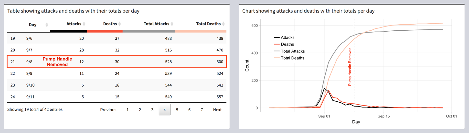
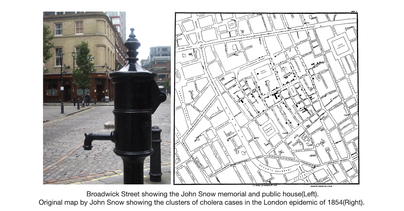
Number of deaths declined even before the pump handle was removed
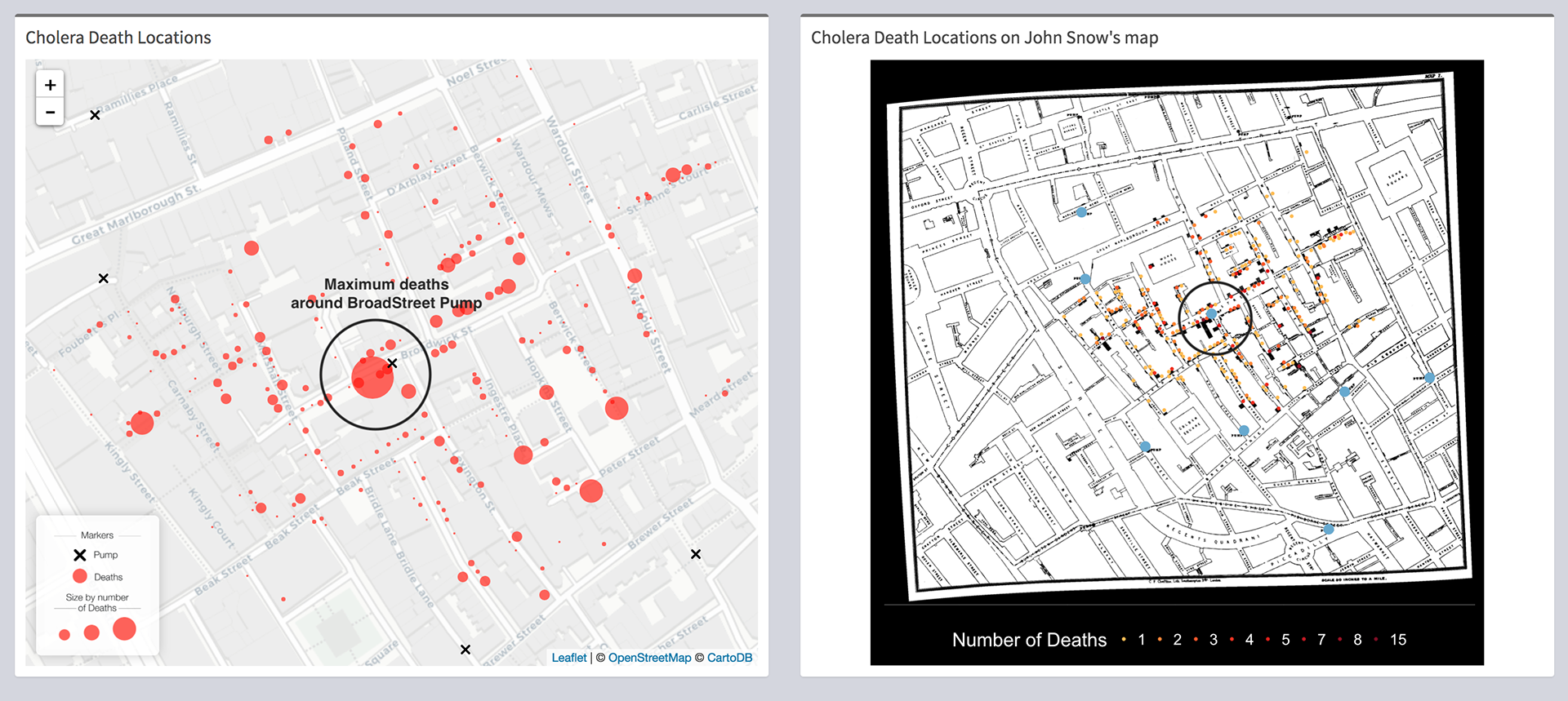
Maximum number of deaths around BroadStreet Pump Location (areas marked in circle's)
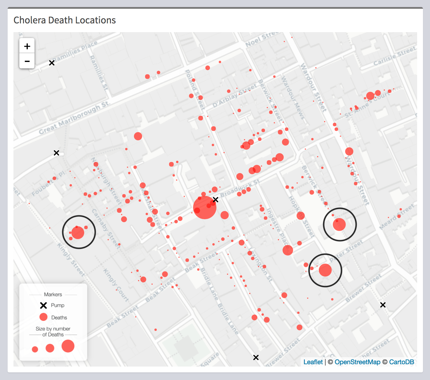
Areas away from BroadStreet pump(shown in circles) with large number of deaths due to preference for BroadStreet pump water
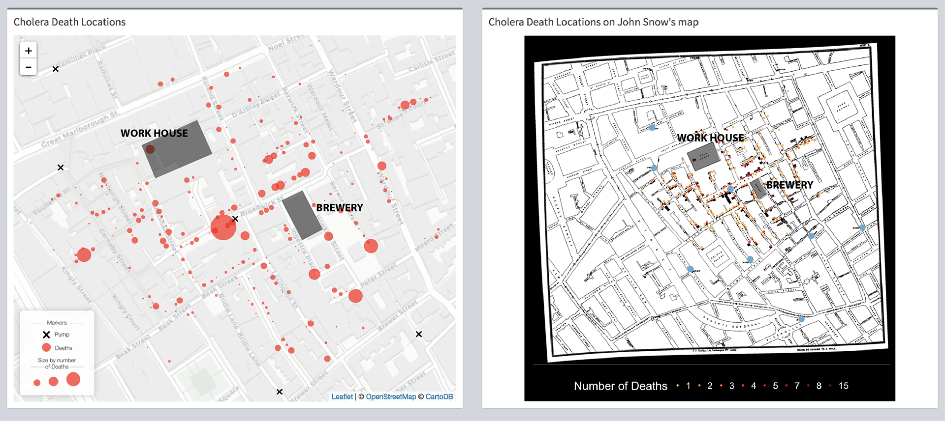
Marked areas represents those with minimum fatalities despite their proximity to BroadStreet water pump.
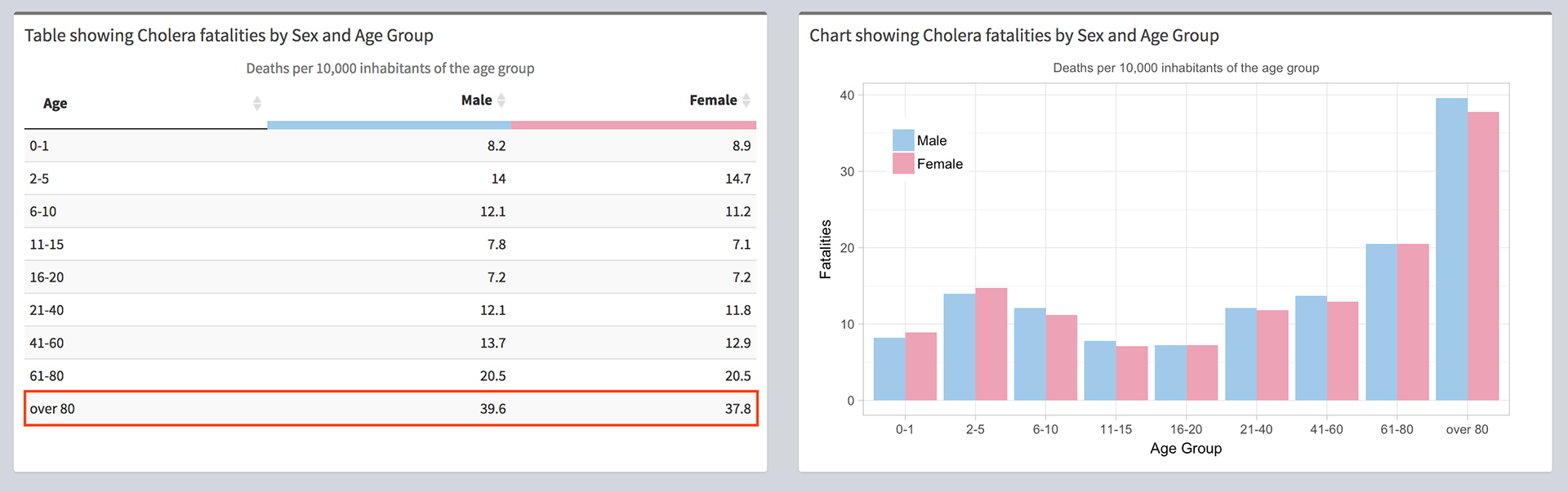
People over the age of 80 constituted most of the Cholera fatalities
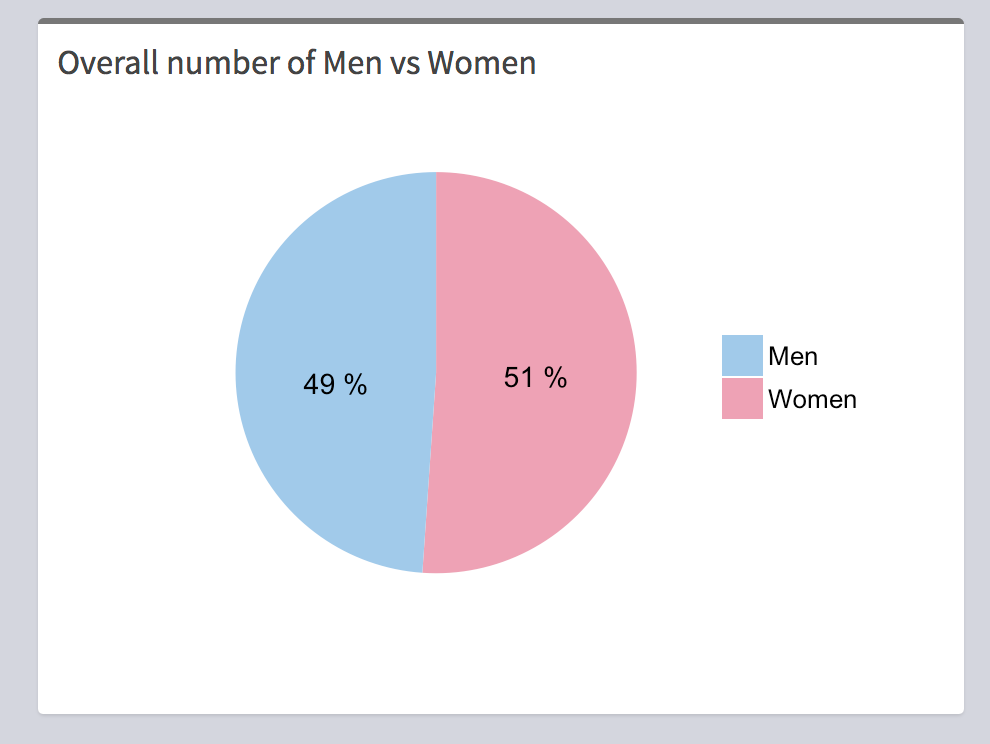
Pie chart showing population distribution on the basis of sex
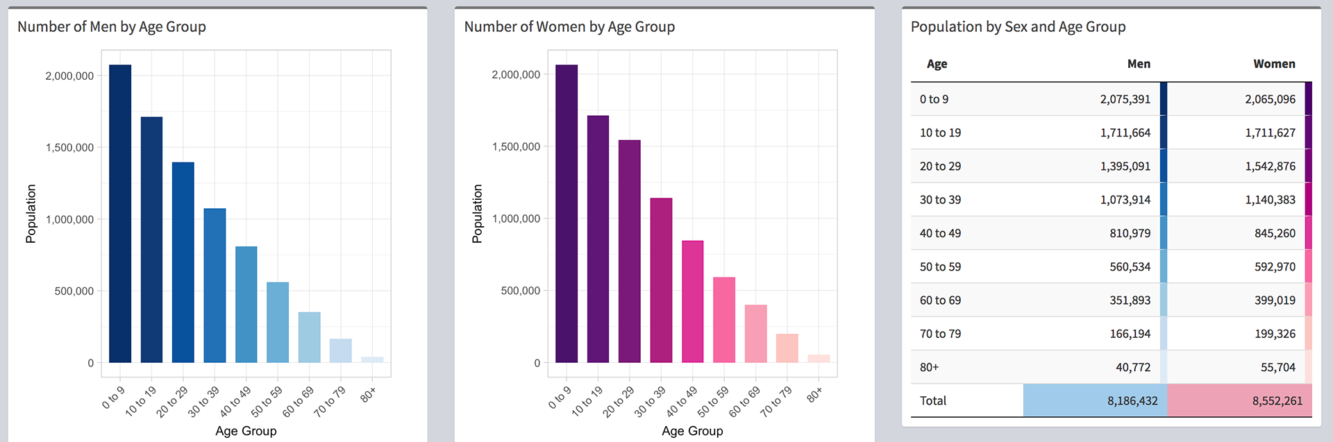
Table and Plots show the distribution of population of different age groups and gender